History And Evolution of Google Logo
A look at the Google logo since its birth in 1997 and how its logo has evolved in designs, colors and fonts.
| Logo | Period | Notes |
|---|---|---|
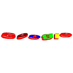 | 1997 | This logo was used during Google's developing stage at Stanford University. |
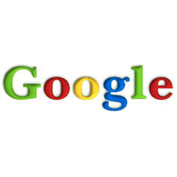 | 1998 | This shortlived logo was used only for a month. The typeface used for the logo is Baskerville Bold. |
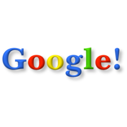 | 1998-1999 | The uppercase "G" was repaced with a blue color and the multi-colored logo design took shape. An exclamation mark was added at the end of the wordmark, possibly to mimic the Yahoo! logo. |
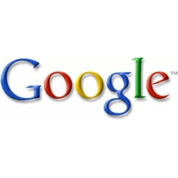 | 1999-2000 | So far the longest used logo of Google, featuring the font Catull BQ and a rotated letter "e". |
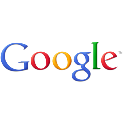 | 2010-2013 | Launched in 2010, this logo is just like the previous logo, except that the colors on the letters now have brighter tones and the shadows behind them have been reduced. |
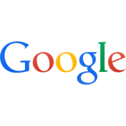 | 2013-2015 | The logo was given a two-dimensional effect, with shadows removed and angles straightened to fit more in line with Google's most recent products. |
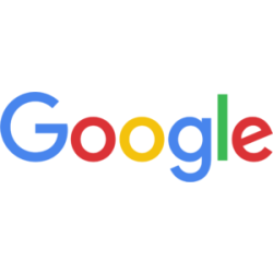 | 2015-Present | On September 1, 2015, Google introduced a new logo, replacing the previous logo's serifed typeface (Catull) with a simplified sans-serifed typeface called Product Sans. |

